
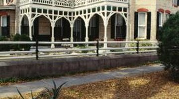
Early 1900 House Colors

In the transition from the 1800s to the 1900s, design color changes mirrored the profound social change and the dawning of the industrial age. Houses that had previously been painted with dark, rich colors were repainted in lighter shades with contrasting accents. Popular exterior colors included silver gray, cream, lemon yellow, ivory, sage and rose, with trim ranging from blue to olive green, rust and brown. Roofs were usually dark colors, including brown and black. Interior paint colors reflected the new trends of each age.
Victorian Interiors
Middle class Victorian families had access to more manufactured goods and the decor of their homes reflected a new prosperity on the cusp of the 20th century. Lavish was the word of the day -- wood trim and paneling was painted in dark oils that mimicked valuable hardwoods; walls were vivid reds and greens, a choice that masked the residue of soot from smoky fireplaces. Dark, strong colors were the foil for an excess of ornament and gilding. The heavy drama didn't lighten up until the innovation of white trim and lighter colors preferred by architects and designers who embraced Queen Anne style.
Edwardian Interiors
As the 19th century drew to a close, ready-mixed paints entered the design lexicon and Edwardian homes had more choices of light colors that came in easy-to-use tins. Decor simplified as people sought cleaner, simpler spaces and better hygiene. Muted and light colors such as pinks, light greens and pale blues, were popular and white trim set off the pale colors. White ceilings reflected much more light. Long-lasting white paint had appeared for the first time in the 1880s, and was used extensively in the late 1800s through the 1920s in Edwardian-style homes. In a holdover from the elaborate decor and darker shades of the Victorian era, trim and decorative work, like chair rails, were often painted gold, green or red in rooms with cream or white walls.
Arts and Crafts Interiors
Arts and Crafts-style houses, in keeping with the designs and color palette designed by William Morris, who led the movement, used muted colors drawn from nature, including light olive and sage, dark -- but not jewel-toned -- reds, dark pink, and gray-blues. Colors for Aesthetic Movement houses were similar to those for Arts and Crafts designs, but with slightly brighter shades of the same colors. An Arts and Crafts home was as far away from a Victorian color palette as it was possible to go, but that didn't mean the choices included pastels. The earth tones favored by those who embraced the style were toned down with the addition of a little black in the lighter hues.
Art Nouveau Interiors
Homes styled in the Art Nouveau fashion used the colors associated with the visual art of that style, as seen in the works of Alphonse Mucha. Deeper tones than those of the Arts and Crafts movement predominated but the colors remained muted. Purple and black were popular as accent colors, while mid-range greens and lilac were au courant wall shades. Many Art Nouveau homes had fairly plain walls decorated with stencils or wallpaper. Bold, clean design elements were part of the Art Nouveau movement and elaborate wallpapers in these colors were used instead of paint.
Outer Limits
Technology and fashion changed the look of neighborhoods as the century changed. Darker, richer colors that covered home exteriors began to lighten up as more stable white pigments came on the market. Trim on a forest green or dark blue house might be white or light gray, and wood roof shingles were no longer uniformly black. Homeowners embraced red, blue, and green alternatives to dark shingles. Gradually, the siding colors shifted to creams, leaf greens, tans and softer grays -- from slate gray to dove. Arts and Crafts bungalows were stained in the lighter shades and their muted colors -- olive, sage, maize and other earth tones -- were often trimmed in glossy cream or white.
References
Resources
Photo Credits
- Photos.com/Photos.com/Getty Images
More Articles